Hi. My name is Kyle.
I grew up in the small towns of Northwest Ohio. Throughout my younger life, I always found inspiration when creating art. It started, as it does for most, with art class. As time went on, I learned more about the commercial side of digital design. Through my 3 years in college, and 5+ years of experience in the field, I’ve perfected my craft while being able to work in every corner of the industry. From website design, to print advertising, to package design and brand identity, my experience has made me well-versed in digital design, consistency, and the importance of brand identity.
- June 2017 - Feb 2020
Digital Design Specialist
FINDLAY DIGITAL DESIGN
My experience at Findlay Digital Design gave me first-hand experience in the realm of website design. Through my time in the position, I designed & developed hundreds of WordPress-powered client & corporate sites, meeting clients requests and needs.
- Feb 2020 - March 2022
Lead Graphic Designer/Manager
FINDLAY DIGITAL DESIGN
The next evolution in my role at Findlay Digital was in a leadership role. In this role, I managed hundreds of client accounts while creating new websites, designing digital ad creatives, supporting the company’s print initiatives, and spearheading locally focused contests to increase brand awareness.
- March 2022 - Sept 2024
Lead Graphic Designer
RANDY'S
In my role at Randy’s, my focus leaned more heavily toward the designing of new product packaging, brand consistency and identity, marketing efforts in the digital landscape, and graphic collateral to support a fast-paced sales team. In this role, I was also able to successfully redesign the company logo and apply its brand standards across media.
- SEPT 2024 - CURRENT
Graphic Designer
STYLE CREST
In my role at Style Crest, my focus is to support the brand by heightening the visual aesthetic across marketing collateral, in-branch experiences, and digital presence.

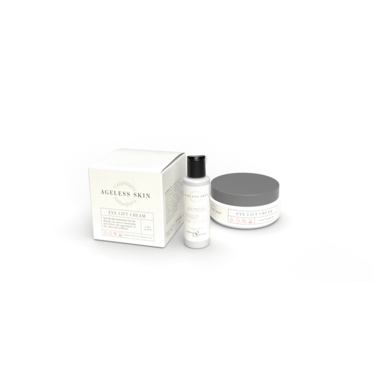
Ageless Skin
THE PROJECT
Ageless Skin, a locally made skincare line, needed a brand overhaul to a logo and package design that hadn’t been touched since it’s inception at least a decade prior. The client had a very specific “vibe” they were going for, so that helped a lot with the direction of the project.
THE SOLUTION
Using the resources that the client provided, I first created a modern logo. Once the client approved of the logo, I began creating a package design for one of the products. Once the design for the packages was agreed upon, I re-implemented that design in every different size of product in the skincare line, keeping the brand consistency intact while also being malleable to whatever container the design was being applied upon.
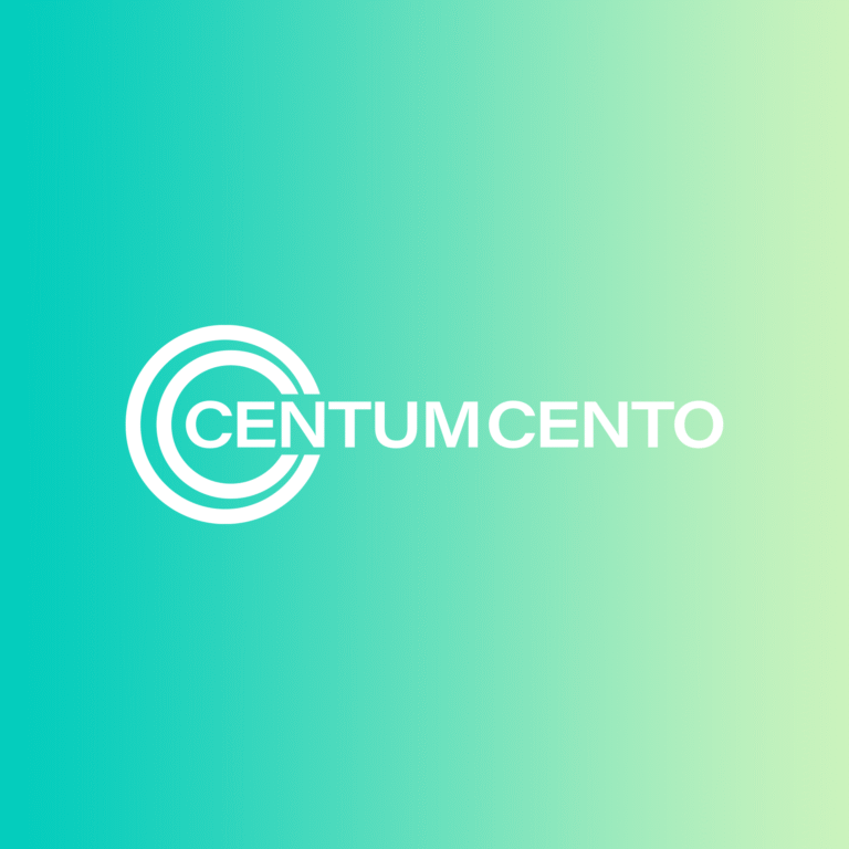
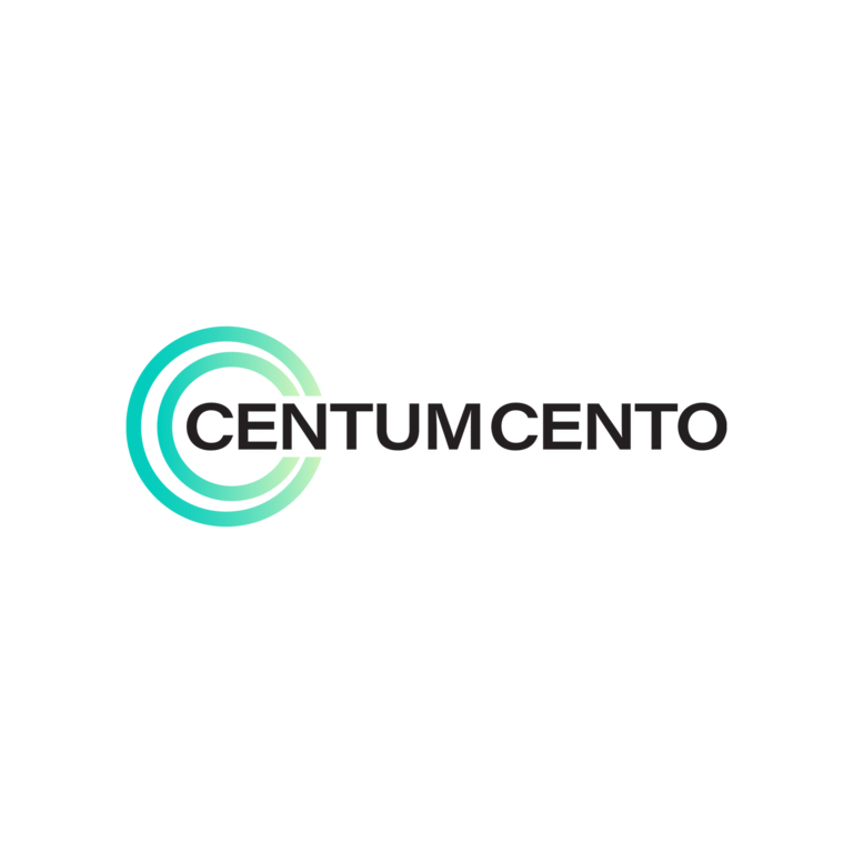
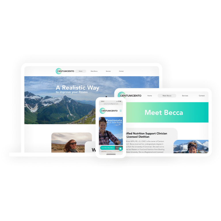
Centum Cento
THE PROJECT
While Centum Cento started as a service designed to focus on helping anyone interested in exercising (primarily in the weight room), through the years the owner had evolved the business into a brand focused on helping its customers by improving their overall lifestyle. With this new found mission, the business owner needed a new brand identity.
THE SOLUTION
I designed a modern logo for what was once Centum Cento Fitness, rebranding it as simply Centum Cento. Using calming green gradients to pay homage to the brand’s past, while also invoking a sense of healthiness into anyone interested in the brand. With the logo design finished, I moved forward to design the entire website. The website is meant to be a hub for potential customers to inform them on what services the business offers, and what prices those services cost. The website is also meant to inform the business owner of what interests a potential client has in improving their health.
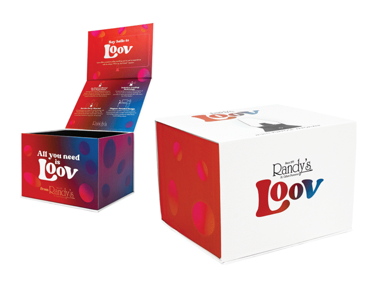
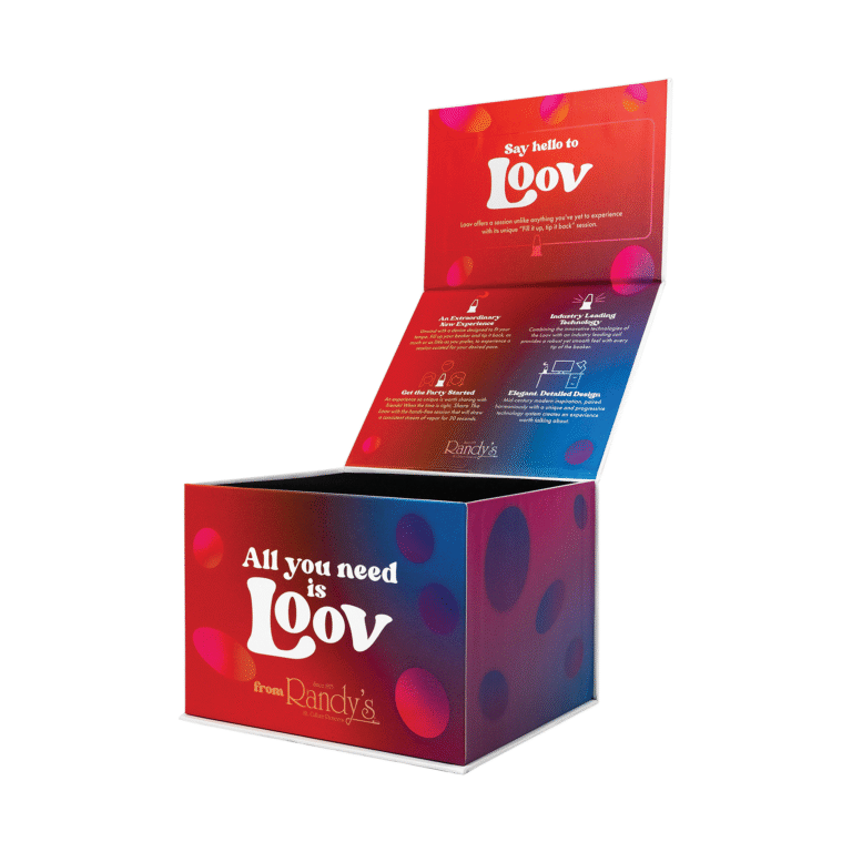
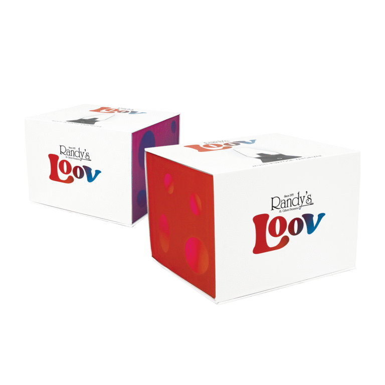
Loov Vaporizer
THE PROJECT
Randy’s, a smoke accessory company, needed a visual language and package design created for the most high-end vaporizer they’ve ever created that would grab the attention of anyone it crossed paths with, while also meeting the high-end standard of the overall product quality by creating an experience for the end user.
THE SOLUTION
I created a logo utilizing inspiration from mid-century modern aesthetic and 1970’s style and a lush gradient that symbolizes the effect of a lava lamp that ties into the shape of the vaporizer. I made sure the entire box opening experience was a high-end one, utilizing a clean design and messaging that makes any user feel as if they are entering a new world when opening the vaporizer.
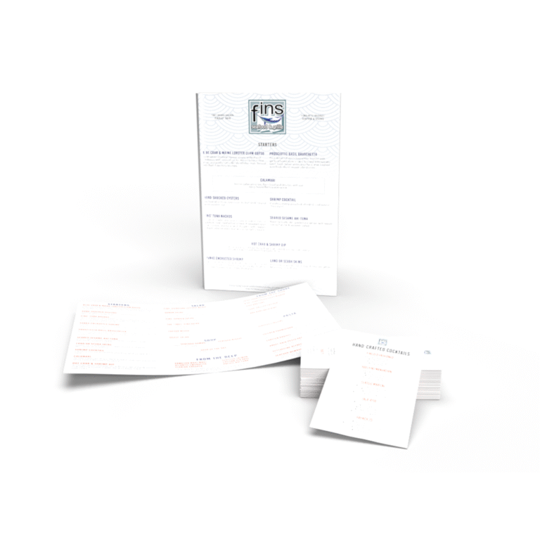
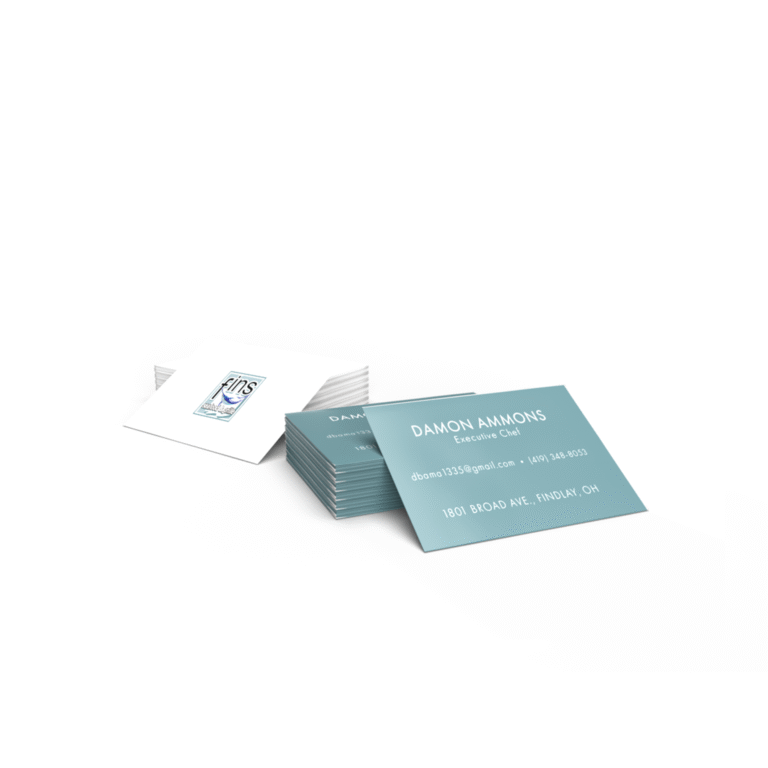
Fins Seafood & Grille
THE PROJECT
Fins Seafood and Grille had a menu that was outdated, with physical wear and tear. They needed an updated look that included all of their existing/current menu items. Along with the main menu, smaller cocktail menus and takeout menus were needed and needed consistency throughout. Beyond menus, they needed updated business cards that made their business look professional when dealing with other vendors.
THE SOLUTION
I created a modern menu that showcased all of their best offerings and gave the vibe of a seafood restaurant, also while making it look professional so they could be taken seriously. After the design of the main menu, I repurposed the design language of that into a smaller takeout menu, and a cocktail menu. I also created a business card design that blends classic sophistication with a modern feel and presents Fins Seafood and Grille as a legitimate and professional restaurant operation.
Need help with anything design?
- LOGO DESIGN
- PRINT DESIGN
- PRODUCT BRANDING
- WEB DESIGN
- EMAIL MARKETING
My portfolio above only tells part of the story. From logos, to web design, to print marketing, and everything in between, I can handle it all and make you look reputable as the end result. Help me help you!